
As I wrote in an earlier post, I have been expanding my reading in works of “later Goethe,” works after his return from Italy. My previous post on Erich Grumach has in the meantime led me to consult Grumach’s two-volume work Goethe und die Antike, an assemblage of everything Goethe expressed about Greek and Roman antiquity. As I was paging through this 1,100-page study, my eyes were caught by (among other subjects) the extracts from correspondence between Goethe and the Swiss artist Heinrich Meyer in the 1790s concerning The Aldobrandini Wedding. The image above is a lovely detail from this Roman fresco, a copy of an ancient Greek painting (for a full-scale image of the work, go here).
One reason that my posts on this blog are not as frequent as I would like is because, as soon as something like this subject interests me, it is necessary to dig into it, and I begin consulting the scholarly research on the subject, which always lead me far afield. The first stop was the article “Die Aldobrandinische Hochzeit als gemalte Farbentheorie” by Johannes Rössler, which appeared in the volume Farben der Klassik. Wissenschaft – Ästhetik - Literatur (2016). I am not an art historian, nor even very knowledgeable about Goethe’s color theory, and am really not competent to take apart Rössler awesomely compounded sentences. My take from his article is the following, namely, that the lack of action in the fresco is compensated for by the expressiveness of the color in the ancient work, in contrast to the “new painting” of the time.
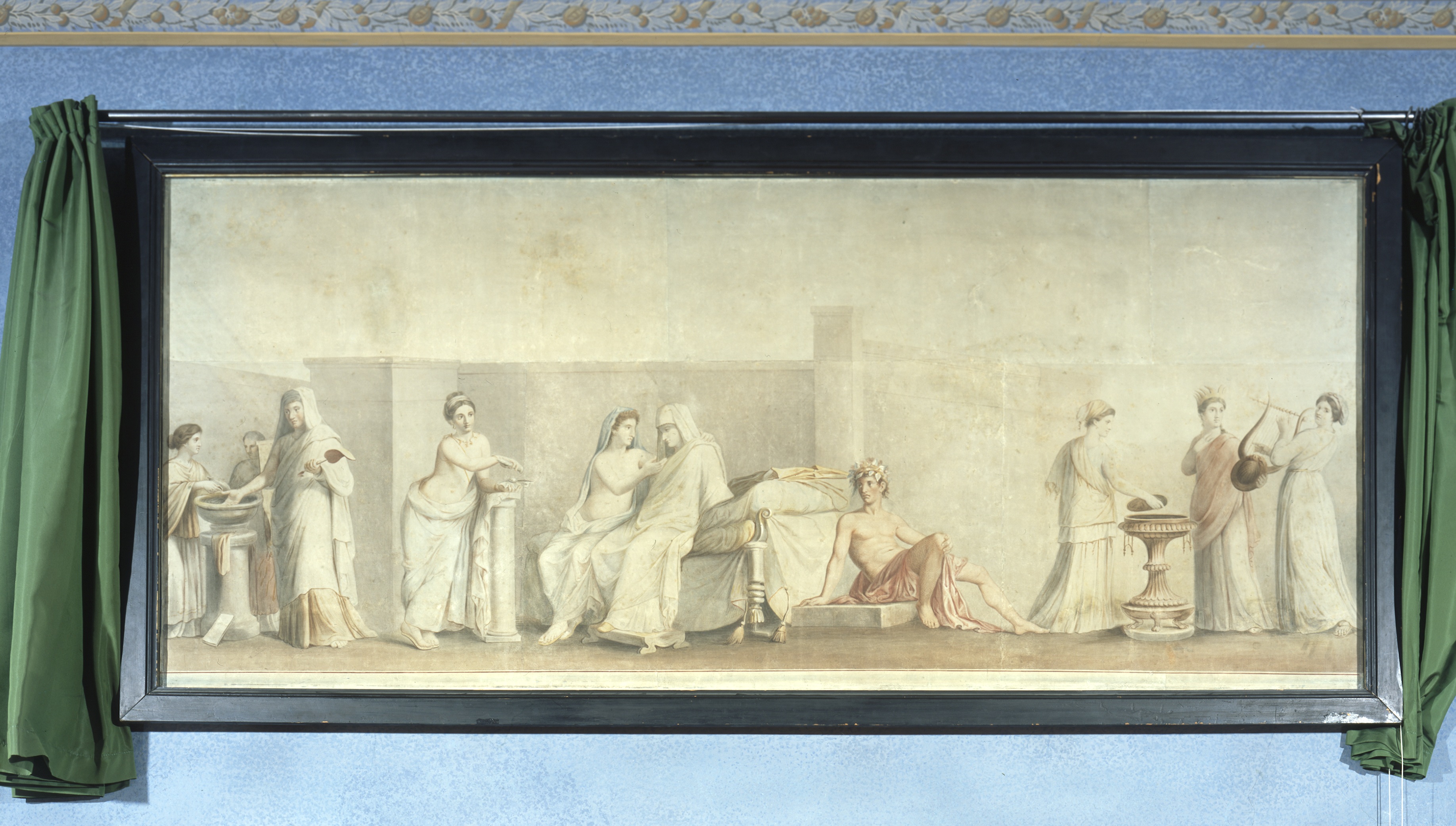 |
| Meyer, Die Aldobrandinische Hochzeit (1796) |
 |
| Meyer, Die Aldobrandinische Hochzeit (1809) |

Max Stevogt, Autumn Forest
Among the scholarship I discovered on this subject is the work of the late Pamela Currie, whose Goethe’s Visual World appeared in 2013. In the last chapter, “An Alternative Antiquity,” she discusses “Goethe’s preference for lightness in painting.” (I have not seen the book, so I am quoting from the 2015 Goethe Yearbook review by Walter Stewart.) Further, “In terms of specific artworks, Goethe and Meyer most preferred the lightness that they observed in The Aldobrandini Wedding.” An article by Currie in Oxford German Studies in 2008 has this to say: “Goethe's and Heinrich Meyer's idea of colour harmony in painting required all the six colours of the wheel, so arranged and modulated as to avoid harsh transitions between them. This prescription resembled the aesthetic of fresco as seen in the ancient Roman 'Aldobrandini Wedding' and in work by Raphael and Paolo Veronese.”
As I said, doing work on any specific area of Goethe leads you far afield. To get an idea of how much effort Goethe devoted to the effect of specific colors, one only has to the look at table of contents of the “Didactic” part of the Farbenlehre. Its final section concerns the “sensuous/moral effect of color” (sinnlich-sittliche Wirkung der Farbe) beginning with yellow, which, Goethe writes, “ist die nächste Farbe am Licht” (the closest color to light).
Image credits: Youpedia; Klassik Stiftung Weimar


No comments:
Post a Comment